In a Noisy World, Visibility Is Everything
Scroll through social media for five minutes and you’ll see it: everyone is promoting something. Services, products, personal brands, events the digital space is crowded, fast, and loud.
But here’s the interesting part.
Offline spaces? Not nearly as saturated.
Bulletin boards in cafés. University hallways. Coworking spaces. Community centers. Local shops. These physical spaces still command attention in a way digital ads often can’t. And when you combine smart design with strategic placement, something powerful happens: people actually stop and look.
That’s where posters come in not the outdated, cluttered kind, but clean, intentional, visually striking designs that feel modern and professional.
Why Posters Still Work (When Done Right)
Marketing trends evolve, but human psychology doesn’t change that quickly. We’re wired to notice contrast. We pause when something visually stands out in a calm environment. A well-designed poster in a physical space often faces less competition than a social media feed.
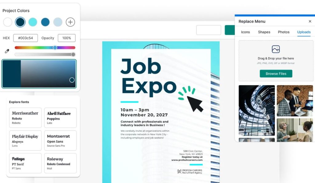
If you’re a freelancer, small business owner, student entrepreneur, coach, or event organizer, using a free printable poster maker to stand out can be a surprisingly effective way to expand your reach without expanding your budget.
The beauty of this approach is accessibility. You don’t need a design degree. You don’t need expensive software. You just need clarity on your message and a smart layout that guides the eye.
And when that’s done well? It converts.
A Real-World Example: The Language Tutor
A university student offering English tutoring struggled to get traction online. She posted in Facebook groups, updated her Instagram, even ran a small ad limited response.
Then she created a clean, bold poster:
- “IELTS Preparation – 7+ Score Guarantee”
- Short bullet points with her credentials
- A friendly headshot
- Tear-off tabs with her phone number
- A QR code linking to a booking page
She placed it on three campus boards and one nearby café.
Within ten days, she had six inquiries.
Why? Because her audience physically passed that board every day. Repetition builds recognition. Recognition builds trust.
What Makes a Poster Actually Stand Out?
Design isn’t about decoration. It’s about communication.
Here’s what separates effective posters from forgettable ones:
1. A Clear Headline
Your headline is everything.
Instead of:
“Services Available”
Try:
“Affordable Branding for Small Businesses”
“Certified Personal Trainer – 1:1 Coaching”
“Professional Resume Writing – Get Interview-Ready”
Specific beats generic.
2. Strong Visual Hierarchy
Your design should guide the reader naturally:
Headline → Supporting Detail → Call-to-Action
If everything looks equally loud, nothing stands out.
Use font size strategically. Use spacing intentionally. Give the eyes room to breathe.
3. One Main Goal
Don’t try to promote five services at once.
Choose one primary objective:
- Book a consultation
- Scan a QR code
- Visit a website
- Call a number
Clarity increases action.
Strategic Placement: The Underrated Skill
Even the best design won’t work if it’s placed randomly.
Ask yourself:
Where does my ideal audience spend time physically?
- Students → Universities, libraries
- Entrepreneurs → Coworking spaces
- Fitness clients → Gyms, health stores
- Parents → Community centers, schools
The more aligned the location, the higher the response rate.
Think quality of exposure, not quantity of prints.
The Psychology Behind Physical Marketing
Here’s something most people overlook: physical marketing feels intentional.
Online ads feel automated. Posters feel personal.
There’s also a subtle authority factor. When someone sees your name displayed publicly, it signals confidence. It says, “I’m serious about what I do.”
And because physical boards are less crowded than digital feeds, your message doesn’t get buried in seconds.
It lingers.
Design Tips from a Branding Perspective
If you want your poster to look modern not amateur keep these principles in mind:
Use a Limited Color Palette
Two or three complementary colors are enough. Overusing colors weakens impact.
Choose Clean Fonts
Avoid overly decorative fonts. Legibility always wins.
Add a QR Code
Make the transition from offline to online seamless.
Include Social Proof
A short testimonial or credential builds trust quickly.
Keep It Simple
If you feel tempted to add more text, remove something instead.
Simplicity signals confidence.
SEO & Cross-Channel Benefits
You might wonder: what does this have to do with SEO?
Actually, a lot.
When people scan your QR code and land on your website, you generate:
- Direct traffic
- Potential brand searches
- Longer session durations
- Increased engagement
Offline exposure can fuel online growth.
And if your website is optimized well, that extra traffic strengthens your authority signals over time.
Smart marketing isn’t choosing online or offline it’s combining both.
Who Should Seriously Consider This Strategy?
This works especially well for:
- Freelancers
- Coaches
- Creatives
- Local service providers
- Event promoters
- Students offering services
If your target audience exists in a physical community, ignoring that space means missing opportunity.
The Quiet Advantage
The truth is, most people won’t do this.
They’ll focus entirely on digital because it feels more modern.
But modern doesn’t always mean effective.
Sometimes, the smartest move is stepping into a less crowded channel with a strong, intentional presence.
When your message is clear, your design is clean, and your placement is strategic, a simple poster can do more than you expect.
Conclusion
Standing out doesn’t require a massive budget or complex campaigns. It requires clarity, creativity, and the willingness to show up where others aren’t paying attention.
In a world overwhelmed by scrolling, a well-designed poster in the right place can feel refreshingly direct.
And sometimes, direct is exactly what works.